Your Wellness Wizards, Just a Tap Away
The Magic Behind Clinikally’s All-in-One Beauty and Health App
Discover how user-centered design transformed the Clinikally app into a seamless experience, connecting you to expert consultations, personalized skincare, and haircare solutions — all in one place.

Welcome to the makeover of makeovers — my personal case study on designing the Clinikally app. This project isn’t just about creating sleek interfaces; it’s about reimagining how technology can enhance our daily beauty and wellness routines, one pixel at a time.
Envision an app that doesn’t just tell you to “drink more water” but provides personalized skincare routines, hair health tips, and connects you with real doctors — all through an engaging, easy-to-use interface. This is the vision I brought to life in this conceptual redesign, turning complex health and beauty needs into simple, delightful interactions.
⭐About Clinikally
Clinikally is a pioneering digital health platform in India, focusing on personalized skincare and hair care solutions. The platform offers:
- Virtual consultations with experienced dermatologists
- An AI-powered diagnostic tool using quizzes and image analysis
- Customized treatment plans tailored to individual needs
- A curated selection of dermatologist-approved products
- Clinikally’s own line of specialized skincare and hair care products
- Convenient home delivery service for all recommended items
📝Understanding the problem & research approach
Imagine battling acne for years, trying countless products based on online reviews or influencer recommendations. Each product promised miraculous results, but nothing seemed to work. Frustrated and confused, booking a dermatologist appointment felt like a daunting and expensive task.
This scenario highlights a common problem faced by many individuals seeking to navigate the complex world of dermatology and skincare.
Pain points & key findings
- Accessibility: Many users struggle to get timely appointments with dermatologists
- Information Overload: Conflicting advice and product claims confuse users
- Personalization: One-size-fits-all solutions often fail to address individual skin concerns
- Consistency: Users find it challenging to maintain a regular skincare routine
- Cost: Professional skincare advice and products can be expensive
Target audience
- Age Range: 18–55 years old
- Gender: Predominantly female, but inclusive of all genders
- Location: Urban and suburban areas, primarily metropolitan cities
- Profession: Working professionals, students, tech-savvy individuals and skincare professionals
- Income Level: Middle to upper-middle class
Secondary research: Analyzing the competition
Existing platforms in the dermatology and skincare space provide a range of services from online consultations to skincare products. However, many lack integration between professional dermatological advice and personalized skincare solutions. Clinikally aims to bridge this gap by offering AI-driven diagnostics and a curated selection of dermatologically approved products.
My goal was to design an app that combines expert consultations with tailored skincare regimens, emphasizing ease of use, personalized recommendations, and comprehensive skincare solutions tailored to individual needs.

By understanding the user’s needs, the target audience, and the strengths and weaknesses of existing competitors, I gained a well-rounded understanding of the market landscape. This information was crucial in shaping the features and functionalities of Clinikally!
🖼️Moodboard
Let’s dive into the moodboard! I crafted a mood board to inspire design ideas. Fonts, colors, layouts, photos — everything came together!

📐Wireframes
With the groundwork laid, it was time for the fun part — sketching wireframes and bringing the concept to life!

🌟Visual Guidelines
To maintain a cohesive visual identity throughout the app, I developed a style guide. The color palette aligns with Clinikally’s existing brand colors, ensuring brand consistency.
For typography, I opted for Raleway, a sleek sans-serif font that enhances readability and complements the modern aesthetic of the platform.

👀First Look
The splash screen features the Clinikally logo, a clean and minimalist design that welcomes users to the app.

📲Login/Signup
The login/signup process is designed for simplicity and ease of use, regardless of whether a user is joining for the first time or returning. Focused on simplicity and ease, the authentication flow ensures a straightforward process. Here’s what makes it smooth:

🏡Home screen
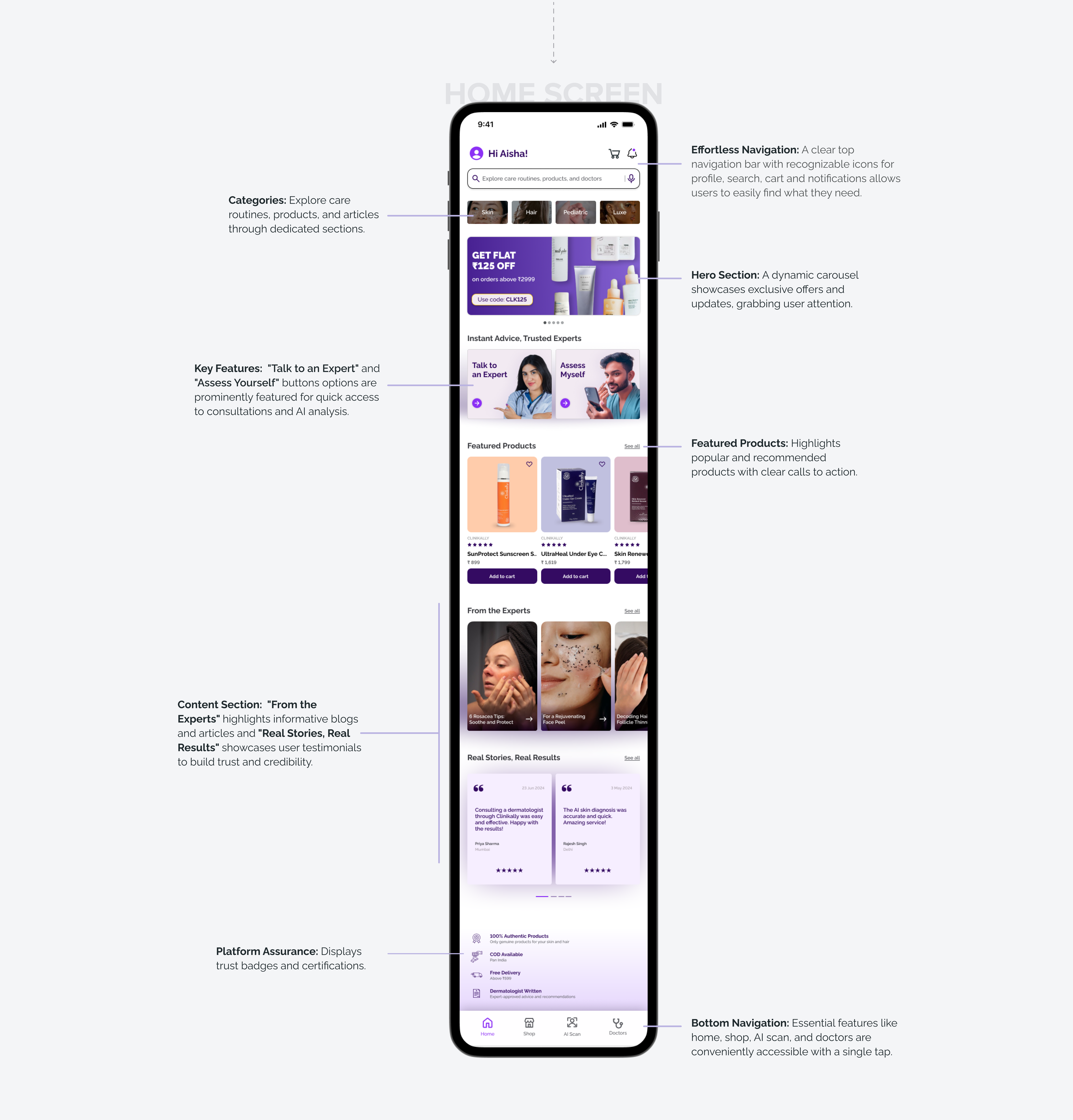
A welcoming first impression, the home screen provides a snapshot of the app’s core features and benefits, inspiring users to explore further.

🛍️Shop and product details
Clinikally’s shopping interface empowers users to make informed skincare decisions effortlessly.
- The personalized skin type selector ensures users see only relevant products, saving time and reducing overwhelm.
- High-quality product images and detailed information, including ingredients and benefits, bring the in-store experience online.
- Customer reviews and ratings build trust, while easy navigation and purchase options make the buying process smooth and enjoyable.
This thoughtful design turns skincare shopping from a chore into a personalized, educational experience.

🩺Booking a consultation
The consultation booking flow is designed to be seamless and efficient. Users are guided through a series of steps, from selecting a doctor to confirming their appointment.

🦱AI Scan
Clinikally’s AI Scan revolutionizes personal skincare by bringing dermatologist-level analysis to your smartphone. In just a few taps, users receive a detailed skin health report, personalized recommendations, and a curated selection of effective products. This feature eliminates guesswork, saves time and money on ineffective products, and provides the confidence of expert-backed skincare decisions. The AI Scan transforms skincare from a confusing chore into an informed, empowering experience.

👧Profile
Your personal corner of Clinikally, the My Profile screen offers quick access to wishlist, saved doctors & consultations, account settings, order history, and helpful resources.

Excited to see the app in action? Try out the prototype! 🚀
✨Reflection and learnings
- This project gave me a fresh perspective on user needs and preferences. I learned to see things from both the user’s and the business’s perspective, which was a game-changer.
- Iterate, iterate, iterate. Refining and tweaking is key to getting things just right.
- Balancing aesthetics and functionality is tricky but rewarding. Finding the sweet spot between aesthetics and functionality was a valuable lesson.
Fin.
Thank you for taking the time to explore this case study. I hope you enjoyed it as much as I enjoyed putting it together! 💟
Your feedback is invaluable! Feel free to share your thoughts and suggestions in the comments below. I’m always eager to learn and grow as a designer. Want to say hi? Connect with me on Twitter and LinkedIn.
🤝 Furthermore, I’m actively seeking opportunities as a Product Designer. Do reach out if you’d like to work with me or collaborate on some projects. Feel free to reach out on Twitter and LinkedIn.
Thank you, have a great day ahead! ❤️
PS: Did you know? You can give up to 50 claps on Medium by long-holding the clap button! 👏🤩

